Chapter 5
Presenting data
Puzzle 1
Dr Tuff was left curled up on the floor in a ball, gently weeping. Zach wanted to coax him out of his emotional hole, and remembered that Edward Tufte set out some principles for good data visualization, which would please Dr Tuff. He felt sure that if he could list as many of Tufte’s principles for what graphs should do as he could, then it would cheer Dr Tuff up. The trouble is Zach’s forgotten them. Can you help him?
- Show the data.
- Direct the reader to think about the data being presented rather than some other aspect of the graph.
- Avoid distorting the data (Milton’s Meowsings 5.1).
- Present many numbers with minimum ink.
- Make large data sets (if you have one) coherent.
- Encourage the reader to compare different pieces of data.
- Reveal the underlying message of the data.
Puzzle 2
What do scatterplots show and how do you interpret them?
Scatterplots are good for summarizing the relationship between two variables. If the data cloud seems to point upwards, this suggests a positive relationship (as scores increase on one variable, they also increase on the other), while if the data cloud points downwards it suggests a negative relationship (as scores increase on one variable, they decrease on the other). If the cloud doesn’t seem to slope up or down, it indicates a very small or non-existent relationship between the variables.
Puzzle 3
What do pie charts show and why are they not a good method for presenting data?
Pie charts show the relative frequency of cases falling into different categories. They are not a good method for presenting data because it is usually quite difficult to see the relative sizes of the segments, so they obscure the data. Some people even exacerbate this problem further by using a pointless 3D effect on their pie chart. For these reasons, it is usually much clearer to present this information as a bar chart.
Puzzle 4
What are error bars?
Error bars can be applied to both bar and line graphs when they show means. They are vertical lines that protrude from each mean to show the precision of the mean. One way to do this is to have the bars extend to 1 standard deviation from the mean, but the error bars can represent other things too.
Puzzle 5
Zach was interested the relationship between how much he charged for his band T-shirts at a gig and how many he sold. What type of graph would he use to display the data? What if he wanted to plot the average number he sold when he gave away a free wristband compared to when he didn’t offer a free gift?
Zach would draw a scatterplot to display the data of the relationship between the two variables Price of T-shirt and Number of T-shirts sold. However, if he wanted to plot the average number of T-shirts sold when he gave away a free wristband compared to when he didn’t offer a free gift, he could draw a boxplot, a bar chart or a line graph as these graphs all plot means.
Puzzle 6
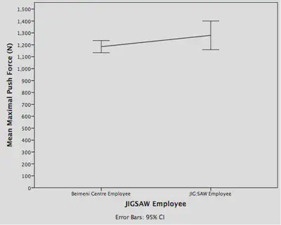
Zach was curious whether the oddities in the JIG:SAW data had something to do with the fact that JIG:SAW is a genetics research centre. He asked The Head to get him some comparable data from the Beimeni Centre of Genetics, where Alice works, so that he could compare the two. The graph in Figure 5.11 (in the book and reproduced below) shows the data for the strength of employees.
What type of graph has Zach drawn in Figure 5.11?
Zach has drawn a line graph with error bars showing the 95% confidence intervals of the mean strength of employees from the Beimeni Centre compared to the mean strength of JIG:SAW employees.
According to the graph, which employees are stronger? Explain your answer.
The graph slopes slightly upwards from the Beimeni Centre employees to the JIG:SAW employees, suggesting that the JIG:SAW employees are stronger, but only by approximately 100N, which is a very small amount. The 95% CI of the mean of the JIG:SAW employees is quite a bit larger than that of the employees from the Beimeni Centre, suggesting that the strength of the JIG:SAW employees is more variable than that of the Beimeni Centre employees. Also, the confidence intervals of the two groups overlap, suggesting that there is likely to be no significant difference between the strengths of the two groups.
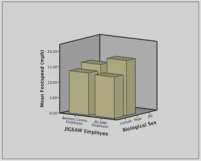
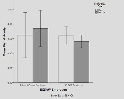
Puzzle 7
Figures 5.12 and 5.13 (in the book and reproduced below) show the footspeed and visual acuity data for the male and female employees at JIG:SAW and the Beimeni Centre.
Both figures show bar graphs.
If you showed Figure 5.12 to Dr Tuff, do you think he would adorn your face with bulldog clips? If so, why? Dr Tuff wouldn’t just adorn your face with bulldog clips, he’d shave your head leaving only 2 inches of hair spelling out the words ‘WHAT WERE YOU THINKING!?’ Basically, this graph is no good because it has a 3D effect that makes it very difficult to read.
Would Dr Tuff purr gently in delight if you showed him Figure 5.13? Explain your answer.
Yes, Dr Tuff would probably purr because it uses two dimensions rather than three, which means that you can see the height of the bars more clearly. Also, the y-axis is scaled from zero so you can see the real differences between groups much more clearly. The inclusion of error bars representing the standard deviations is also useful because they provide information about how well the mean fits the data. Finally, having different colours representing male and female candidates and a key to indicate this makes it very easy to compare the bar heights for these two groups.
Is the mean male and female footspeed comparable in the two institutes? Explain your answer.
The graph in Figure 5.12 is fairly difficult to interpret because of the 3D effect, but it suggests that on the whole males are faster than females across the two institutes. We can tell this because the two bars representing the male employees are higher than both the bars representing the female employees. The mean footspeed for females looks very similar across the two institutes, but the mean footspeed of males is higher in the JIG:SAW employees than in the Beimeni Centre employees.
Is the mean male and female visual acuity comparable in the two institutes? Explain your answer.
The key at the foot of Figure 5.13 tells us that the white bars represent male employees and the grey bars represent female employees. Looking at the comparable heights of the bars within each institution it appears that at the Beimeni Centre, female employees have better visual acuity than males, but at JIG:SAW male employees have better visual acuity than females. If we look at the 95% CI error bars we can see that at both institutes the bars for male and female overlap quite substantially, suggesting that the difference between the male and female groups might not be significant.
Puzzle 8
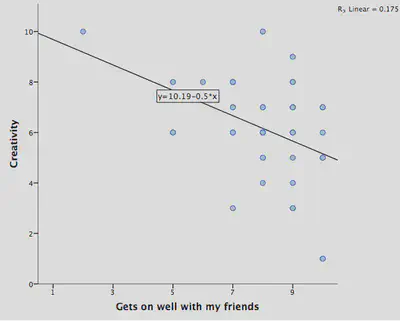
Zach thought that Alice would rate creativity highly as a characteristic that she likes in her boyfriend. He also worried because he often found it hard to get on with Alice’s scientist friends. He wondered whether women who liked creativity in their partner also liked them to get on with their friends. He took another sample of 45 cases from the Ha et al. study data (Reality Check 3.1) and plotted the ratings that women gave for ‘creativity’ and ‘gets on with friends’. Remember that each woman is rating on a scale from 1 (not important at all) to 10 (very important) how important this characteristic is to her in a romantic partner. A graph of the data is shown in Figure 5.14 (in the book and reproduced below).
What type of graph has Zach drawn?
A scatterplot, which is a graph that plots each person’s score on one variable against their score on another. There is also a line on the plot to summarize the trend in the data.
What does the graph suggest about the relationship between women’s ratings of creativity and the ability to get on with their friends as characteristics they seek in romantic partners?
The line that summarizes the data points downwards, which suggests that high scores on ‘creativity’ tend to accompany low scores on ‘gets on with friends’, but low scores on ‘creativity’ tend to accompany high scores on ‘gets on with friends’. This is known as a negative relationship and suggests that women who value creativity in a romantic partner highly tend not to value whether or not their partner gets on well with their friends highly, and women who value whether or not their romantic partner gets on well with their friends highly tend to not value how creative their partner is very highly. The strength of this trend will reflect how closely the line represents the cloud of data (i.e., whether dots tend to be packed tightly around the line (high-magnitude correlation) or are scattered diffusely around the line (low-magnitude correlation)
Are there any cases that look like outliers?
Outliers are cases that don’t fit the model very well, so at face value the case that scores around 1 for ‘creativity’ and 10 for ‘gets on well with my friends’ is an obvious outlier. However, the case to the far left of the plot that scores 2 for ‘gets on well with my friends’ and 10 for ‘creativity’, although not an outlier (the model predicts this value closely), could be an influential case because it is the only case with such a low value on ‘gets on well with my friends’ (all the other cases score 5 and above on this variable). Therefore, this case could be dragging the line towards it; in other words, the line summarizing the data could potentially have a different slope if this case weren’t there.
Puzzle 9
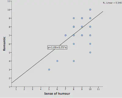
Zach was also fairly confident that most people thought he was romantic and had a good sense of humour. He wondered whether if Alice liked a good sense of humour (which she did) then she’d also want a partner who is romantic. To get some idea, Zach again took a sample of the Ha et al. data of women’s ratings of characteristics in their partners (from 1 = not important at all to 10 = very important). Again Zach plotted these data (Figure 5.15 in the book and reproduced below). Can you help him to interpret the graph? How does the relationship differ from the one in the previous puzzle?
The data in Figure 5.15 show a positive relationship between the variables ‘good sense of humour’ and ‘romantic’. The cloud of data points slopes upwards. That is, women who rated a good sense of humour as an important characteristic in their partner tended to rate being romantic as an important characteristic in their partner, and women who rated a good sense of humour as being unimportant in their partner tended to rate being romantic as unimportant. This relationship is opposite to the one in the previous puzzle as it shows a strong positive relationship, whereas the relationship in the previous puzzle was negative. Also, this graph doesn’t appear to have any outliers or influential cases, which suggests that the model might be a better fit to the data than the one in the previous puzzle.
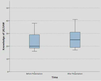
Puzzle 10
After the JIG:SAW recruitment event where Zach saw Rob Nutcot deliver a presentation, he felt none the wiser about JIG:SAW. He put this down to the fact that Rob spoke like an imbecile. However, Zach worried that perhaps everyone else in the room had understood, and it was only he who didn’t. Luckily, they collected data at the event to test attendees' knowledge of JIG:SAW before and after Rob’s speech. Zach plotted the data in Figure 5.16 (in the book and reproduced below).
What type of graph has Zach drawn?
A boxplot or box–whisker diagram.
Did people’s knowledge of JIG:SAW increase from before to after Rob’s presentation? What are the implications?
The boxplot has not been drawn to Dr Tuff’s high standard because there are no units of measurement on the y-axis. However, putting that aside, we can see that the median knowledge of JIG:SAW is slightly higher after Rob’s speech than it was before his speech. However, the boxes overlap a lot, which shows that the middle portions of both groups of scores are similar. Additionally, the whiskers are not dissimilar in the two groups, suggesting that the range of knowledge of JIG:SAW in the two groups is not too different; in other words, Zach wasn’t the only one who didn’t have a clue what Rob Nutcot was going on about in his speech. Incidentally, it appears that neither group has any outliers because there are no dots above or below the whiskers of either of the boxes.